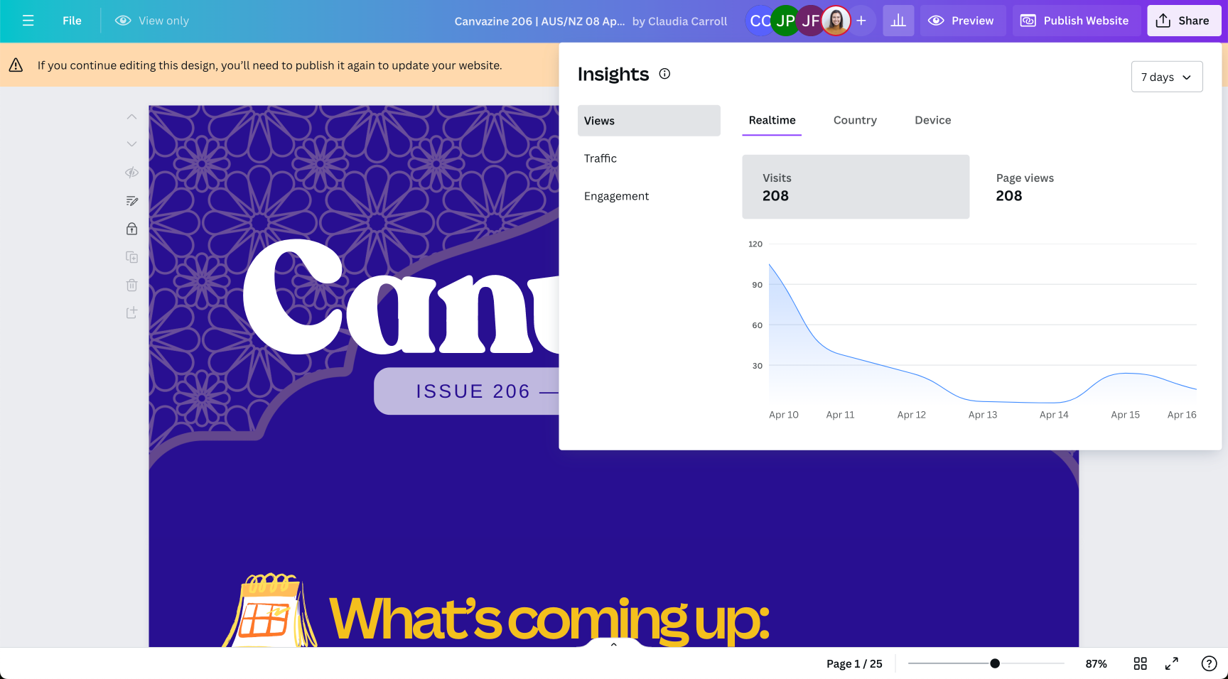
Design Analytics in Canva
Timeline: 6 months | 2024

Overhauled design level analytics to deliver clear, detailed, and impactful metrics that help customers understand their designs' performance and take action.
The opportunity.
User problem
Customers have poor visibility into how their designs are performing, with limited analytics to guide improvements or incentivize on-platform sharing. This leads to missed opportunities for content optimization and contributes to the broader issue of customers downloading designs instead of sharing them directly on Canva.
Key usecases:
Sales person - Key JTBD: External content sharing with leads and clients
Sends pitch to prospect, reviews analytics to assess engagement, and refine content or follow-up comms based on data.Knowledge worker/HR - Key JTBD: Internal content sharing
Send internal comms to large employee groups, analyse performance, and create reports to recommend optimisations for future.
Business strategy
This project aligned with the company’s strategic pillar to establish Canva as a highly adopted workplace tool. By providing customers with analytics directly within Canva, without relying on additional tools, creates a seamless flywheel: users share designs on Canva, track performance, and return to Canva to view analytics and optimize their content. This not only positions Canva as a must-have enterprise tool but also strengthens its sharing and collaboration value propositions—two of the most valued features for enterprise users.
“We create with Canva to drive engagement. We need an easy way to see if our content is engaging.”
— ScribeAmerica
The solution.
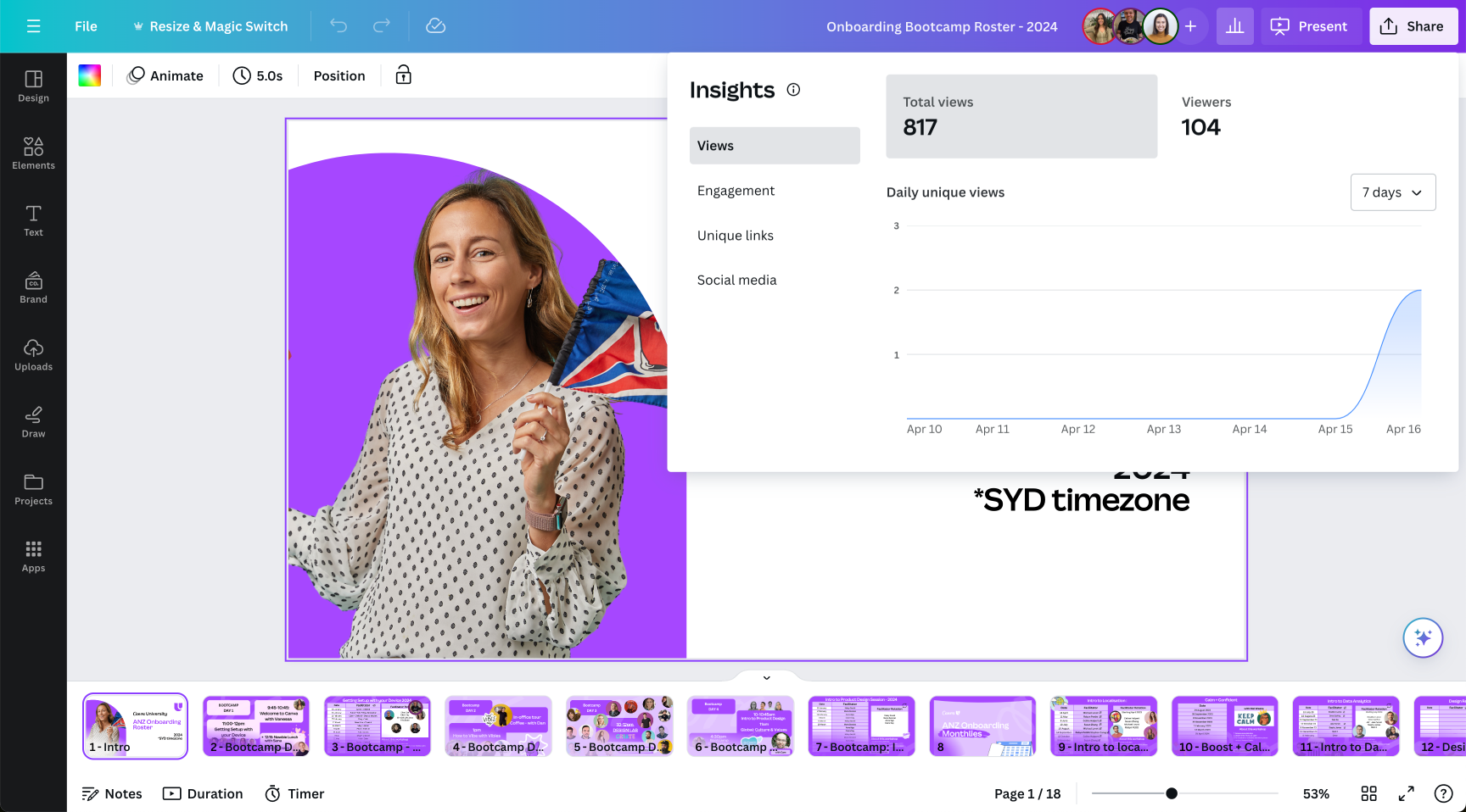
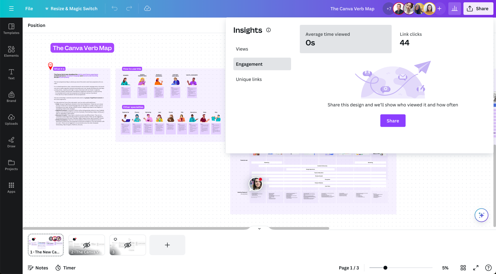
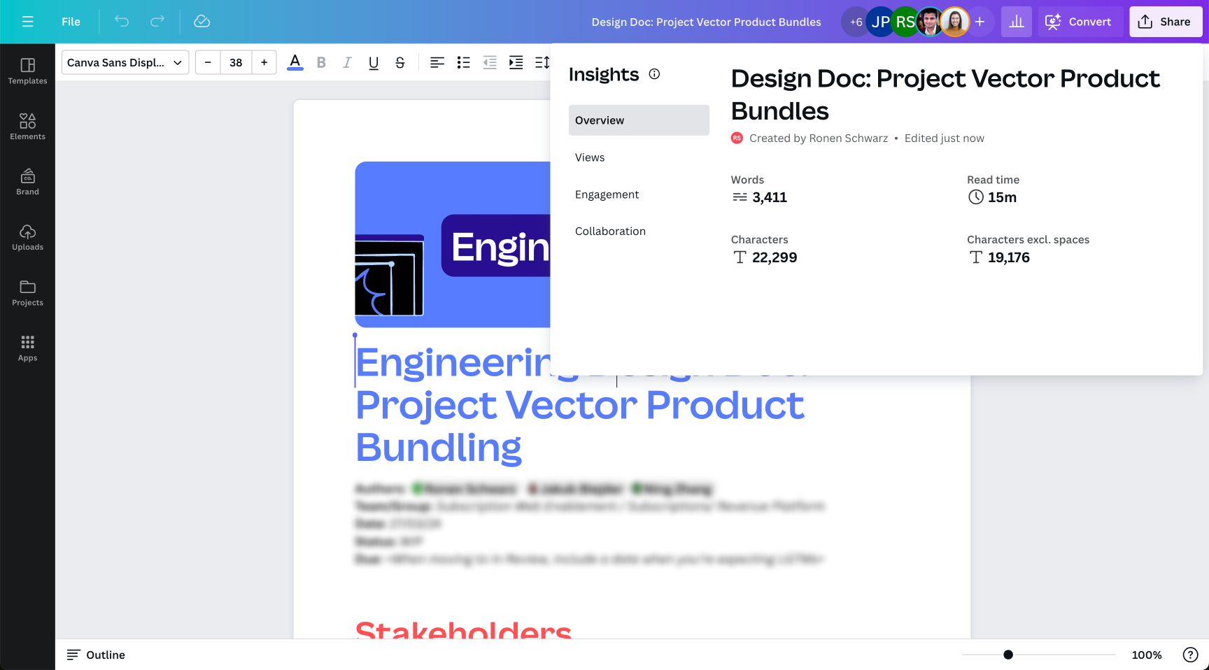
Redesigned analytics modal
Before: Unclear metrics and inconsistent experiences across file types left users confused, reducing trust and limiting scalability.
After: A unified, visually refined modal with clear metric visualizations, increased screen real estate for scalability, and a consistent experience across all file types — enhancing usability and trust.
Improved navigation and information architecture
Before: Confusing and inconsistent navigation made it difficult for users to distinguish between internal and external sharing, leading to uncertainty about which metrics applied to each.
After: The updated navigation clarifies different use cases, improves discoverability, and makes analytics more intuitive and actionable.
Updated copy and tooltips
Before: Unclear labels didn’t meet user expectations and lacked sufficient detail, leading to confusion and an unintuitive experience.
After: Aligned terminology with industry standards (e.g., renaming “viewers” to “visitors”) and introduced tooltips to provide clear definitions and improve usability.
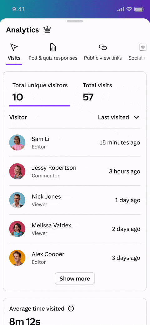
Richer, granular engagement analytics for internal visitors and external visitors
Before: Metrics were limited and unreliable, providing little insight into design performance. This lack of value contributed to low feature usage and retention.
After: Introduced granular metrics for both internal and external visitors, enabling users to make more informed decisions and creating a useful experience that users will want to return to.
Now, users can easily understand:
Who has visited their design
When they visited
How long they spent on the design in total
Which pages they visited
How long they spent on each page
Top-performing pages
Which links were clicked
How many times links were clicked
Make it easier for users to share tracked public view links
Before: Users had to navigate between two types of external links — Tracked links and Public view links. While both offered the same consumption experience, only Tracked links captured analytics, but they were hard to discover, leading to low usage. Public view links, though more frequently used, did not capture any data, resulting in users missing out on valuable insights. This duplication caused confusion and added unnecessary mental load for users.
After: The two link types have been consolidated into a single, unified Public view link, which is always tracked and captures analytics. Public view links can now be easily created and configured directly from both the share menu and the analytics modal, improving discoverability. This simplification reduces confusion and provides a more cohesive and intuitive user experience.
Empty states and upgrade prompts
The four different states shown here for the 'Visits’ page, this same pattern was applied to all other pages.
All pages of the Analytics modal require four different states to address empty states and upgrade prompts
Free user, no data: Prompt to share the design to gather data and upgrade to a paid plan to unlock all metrics.
Free user, has data but can’t view it: Prompt to upgrade to a paid plan to unlock all metrics.
Paid user, no data: Prompt to share the design to gather data.
Paid user, has data: No prompts required.
The previous experience.
The previous experience was deprioritized for several years as company priorities shifted. This led to a fragmented and confusing user experience, with broken analytics and inconsistent metrics across different file types as seen below.
These issues contributed to poor performance, with 0% year-over-year usage growth, just 5% user retention, and an average of 1.96 uses per month for Pro users — far below the 20.73 uses per month seen with Brand Kit, a top-performing paid feature.
The impact.
While the feature was still in the process of being fully rolled out during my final weeks at Canva, the design changes are a vast improvement on the user experience and unlock scalability for future growth. While full quantitative impact is still to come, the initial qualitative feedback was overwhelmingly positive:
Usability Testing: Users appreciated the improved modal experience, reporting greater ease of use and excitement at the new metrics.
Staff Beta: Internal teams praised the intuitive design and better engagement.
C-Suite Leadership: The new design was well-received by senior leadership, with executives highlighting its potential to support long-term business objectives such as improving user retention and scalability. Their support underscored the strategic alignment of the project with Canva’s broader vision for growth.
These early insights confirm that the new experience is on track to drive increased user satisfaction and long-term business success.
Key moments in the design process
👇
Key moments in the design process 👇
Strategy, roadmap, and prioritization
Step 1
Lay foundations | 6-8 months
Relaunch easy-to-understand design analytics that empowers users to seamlessly share and track their designs with internal collaborators and external consumers.
Lay foundations roadmap
-
Ensure all metrics are accurate and easy to understand and trust.
-
Launch new, more granular metrics that drive decisions and remove any metrics that don’t.
-
Redesign the experience so that users can connect insights to their workflows to help them take a next action at the right time.
-
Make it simple and seamless to share and consume public view links so more users can unlock analytics.
-
Enhance user engagement by reimagining empty states and upgrade prompts to provide clear guidance, highlight value, and encourage users to take action.
Step 2
Build differentiators | 6 months
Launch data-led optimisation suggestions, aggregated analytics and positive reinforcements to make checking design analytics and optimising designs a habit.
Build differentiators roadmap
-
Notify users through emails and notifications about new analytics, enabling them to respond to audience interactions in real time without needing to manually check their designs.
-
Help guide users to make data-driven decisions, improving their content and how they engage their audience.
-
Leverage insights to help users celebrate milestones and connect to community.
-
Help users choose best performing content from their folders with easy to view aggregate analytics.
-
Integrate with platforms that complete user workflows such as Salesforce and Hootsuite.
Managing dependencies and collaborating across teams
Collaboration with other teams was a critical part of this project, as working on the design analytics modal intersected with several parallel initiatives. To ensure alignment and a cohesive user experience, I worked closely with the following teams:
Polls and Quizzes Team
The polls and quizzes team needed to surface their results within the design analytics modal. I reviewed their designs and iterated on them to align with the broader visual and interaction patterns of the experience. This ensured that their integration felt seamless and intuitive for users, while maintaining consistency with the rest of the analytics experience.
Mixed File Type Squad and Website Team
The mixed file type squad was tackling a major initiative to make Canva files more flexible by allowing multiple file types within one container. Simultaneously the website team was enabling any file type to be published as a website, which introduced a new dimension of analytics—allowing designs to have both design-level and website-level metrics.
I collaborated with both teams to ensure that the new analytics experience was scalable across all these changes to how files and websites worked and that for customers they would have a simple and unified experience.
Share and Publish Team and Presentations Team
These teams owned key parts of the tracked links flow and public view experience. I worked with them to:
Influence and refine the flows to make sharing links on the platform more discoverable and easier for users.
Enhance the professional look and feel of shared links, reinforcing Canva’s value as a tool for workplace collaboration.